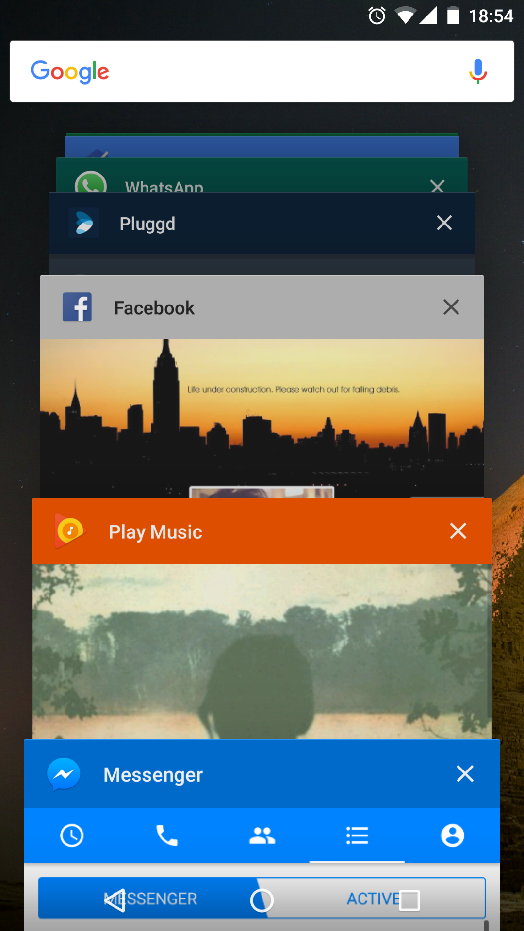
With Android 5.0, there was a complete revamp of the “Recent Tasks” implementation on Android. The changes impact the way we think of tasks, as well as how they are presented in the Overview Screen. I may get into the logical, and implementation level changes at a later date, but first we tackle the visual changes.
To keep the UI in line with the colorful, fun, approach of the rest of the OS, an API was introduced to give developers some manner of control over the presentation of their tasks in the Overview Screen. The entry has three components: Label, Icon & Color.
Following is a small code-snippet that takes care of the styling for you 🙂
/**
 * Helper class that applies the proper icon, title and background color to recent tasks list.
 */
public class RecentTasksStyler {

    private static Bitmap sIcon = null;

    private RecentTasksStyler() {
    }

    @TargetApi(Build.VERSION_CODES.LOLLIPOP)
    public static void styleRecentTasksEntry(Activity activity) {
        if (Build.VERSION.SDK_INT < Build.VERSION_CODES.LOLLIPOP) {
            return;
        }

        Resources resources = activity.getResources();
        String label = resources.getString(activity.getApplicationInfo().labelRes);
        int colorPrimary = resources.getColor(R.color.theme_primary);

        if (sIcon == null) {
            // Cache to avoid decoding the same bitmap on every Activity change
            sIcon = BitmapFactory.decodeResource(resources, R.drawable.ic_launcher);
        }

        activity.setTaskDescription(new ActivityManager.TaskDescription(label, sIcon, colorPrimary));
    }
}
Just call this in the onCreate of any activity, and it will apply the default app theme to the Recent Tasks entry.


