Personal touch is crucial when you design products, whether it is about how the product looks and behaves, or the subconscious response after using it.

I couple of days ago, Github released its native client for Windows and Mac OS X, dubbed Github Desktop. As a long time SourceTree user, I was skeptical about the new solution, to the extent that I questioned the need for this product.

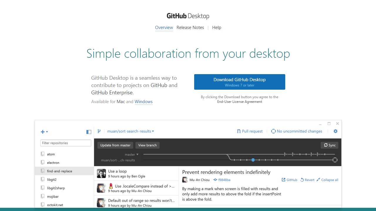
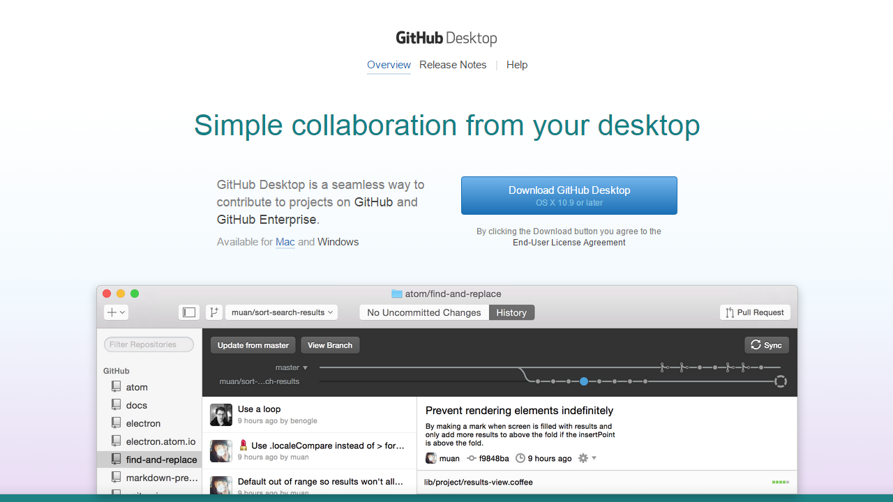
I checked the website out to get an overview, in case there are any innovations, and that is when I was pleasantly surprised. The entire website looked like it was designed for Windows.

GitHub Desktop Windows Cropped

GitHub Desktop on a Windows PC

Wondering how it would feel to a Mac user, i fired up the iMac. And things got downright amazing. The website looked like it was designed for OS X. The entire look and feel of the website, right from the images and fonts, to the colors on the backgrounds and buttons changed on the basis of the OS I was browsing from.

GitHub Desktop Mac Cropped

GitHub Desktop on Mac OS X

This is what I have always been talking about: design with the end-user in mind.

Love the personal touch. Kudos to the team for pulling it off with such style.

PS: Their attention to detail has at least got me to try GitHub Desktop. If they keep it up, they might have a convert!

This entry was posted in UX. Bookmark the permalink. Follow any comments here with the RSS feed for this post. Post a comment or leave a trackback: Trackback URL.

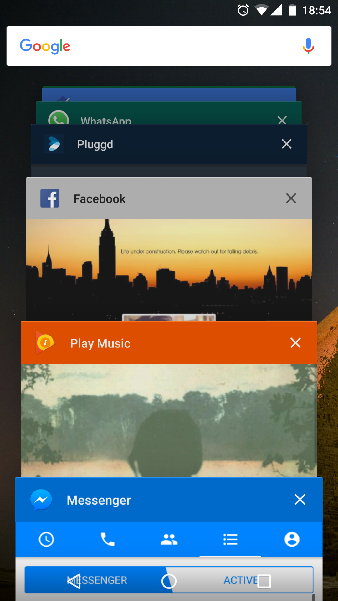
With Android 5.0, there was a complete revamp of the “Recent Tasks” implementation on Android. The changes impact the way we think of tasks, as well as how they are presented in the Overview Screen. I may get into the logical, and implementation level changes at a later date, but first we tackle the visual changes.

To keep the UI in line with the colorful, fun, approach of the rest of the OS, an API was introduced to give developers some manner of control over the presentation of their tasks in the Overview Screen. The entry has three components: Label, Icon & Color.

Styling Recent Tasks

Following is a small code-snippet that takes care of the styling for you 🙂


/**
 * Helper class that applies the proper icon, title and background color to recent tasks list.
 */
public class RecentTasksStyler {

    private static Bitmap sIcon = null;

    private RecentTasksStyler() {
    }

    @TargetApi(Build.VERSION_CODES.LOLLIPOP)
    public static void styleRecentTasksEntry(Activity activity) {
        if (Build.VERSION.SDK_INT < Build.VERSION_CODES.LOLLIPOP) {
            return;
        }

        Resources resources = activity.getResources();
        String label = resources.getString(activity.getApplicationInfo().labelRes);
        int colorPrimary = resources.getColor(R.color.theme_primary);

        if (sIcon == null) {
            // Cache to avoid decoding the same bitmap on every Activity change
            sIcon = BitmapFactory.decodeResource(resources, R.drawable.ic_launcher);
        }

        activity.setTaskDescription(new ActivityManager.TaskDescription(label, sIcon, colorPrimary));
    }
}

Just call this in the onCreate of any activity, and it will apply the default app theme to the Recent Tasks entry.

It's kinda sad that the folks at Facebook cannot find time to add 10 lines of code.

It’s kinda sad that the folks at Facebook cannot find time to add 10 lines of code.

This entry was posted in Development and tagged , . Bookmark the permalink. Follow any comments here with the RSS feed for this post. Post a comment or leave a trackback: Trackback URL.

One big fail in Google+ (Web) that I have come across recently is that the search bar goes away as the user scrolls down. It’s frustrating to have to scroll all over the place, just to do a simple search.

Usually, the reason for hiding the top bar is be to provide more screen real-estate for the content, but the strange thing here is that there is a sticky bar, and the bar has more than enough space to accommodate the search bar. It’s just the bar which contains the search is not the one that sticks. The issue feels self-imposed, a limitation of the way the header is split. The behavior, introduced in the not-so-recent UI refresh just feels like a big UX miss, and I wonder what urged them to make it this way.

It’s a wonder how Google can make this mistake, considering all the other social network heavy-weights seem to have this right. Search is what made Google what it is, so this flaw feels all the more wrong. Misleading user feedback, or a simple miss, I wonder?

This entry was posted in UX and tagged , , , . Bookmark the permalink. Follow any comments here with the RSS feed for this post. Post a comment or leave a trackback: Trackback URL.

I’ve realized putting together and running a start-up can be extremely hectic, leaving no time for other activities (blogging included). I’ll be taking a hiatus from blogging till things get a little more relaxed.

I should still be reachable on Google+, Facebook and Twitter, though my activity on the networks tend to vary greatly.

This entry was posted in Uncategorized. Bookmark the permalink. Follow any comments here with the RSS feed for this post. Post a comment or leave a trackback: Trackback URL.

It’s been a while, folks! Have been busy mostly with the development of rootwork.co, and zitrr.com websites, and overhauling my own Homepage!

A lot of things have come to a hold to get my Startup running, but my crazy desktop mods will not! 🙂
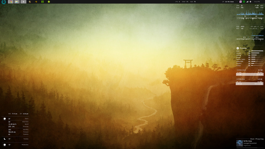
Today’s shot shows mostly stock Enigma with a helping of mods to get exactly what I want.

Desktop Screenshot: February 2013

If you view the full-res shot, you’ll notice the CPU/RAM/Swap/Up-Time info overlaying the Taskbar. They’re way more useful than I thought they’d be when I put them up there… I find that with the Chrome+Photoshop/Illustrator+Dreamweaver combo up, 4GB of RAM is really lacking (no surprises there!) The Mac has a decent processor, but I really need to save up and get myself some Vengeance!

Beautiful Wallpaper, don’t you think?

This entry was posted in Mods and tagged , , , , , , , . Bookmark the permalink. Follow any comments here with the RSS feed for this post. Post a comment or leave a trackback: Trackback URL.

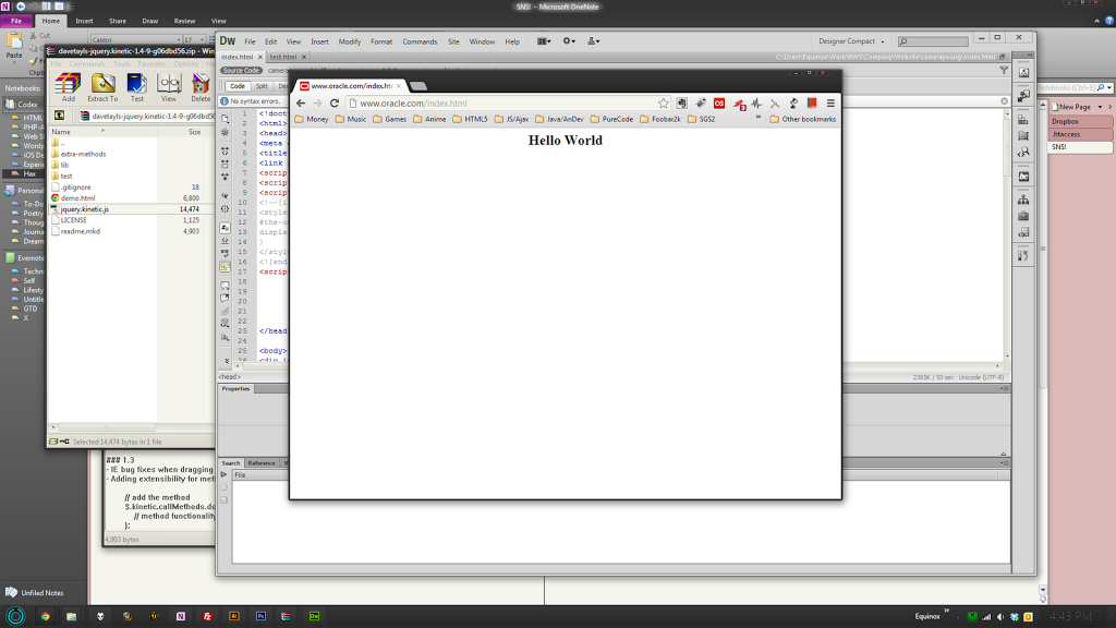
It so happens every once in a while, that a Goliath is beaten by a David. I suppose this could go down as one of those instances…

Oracle Website Hacked

The question is, if Oracle’s own servers are not secure enough, what about the data they handle, and their famed DataBase Systems?

Let’s wait and watch how long it takes for them to get things up and running again!

(Edit 12:00 PM GMT): The site seems to be up and running again… That was fast! So fast, that it is possible it was just an internal mess-up. Wonder if the heavyweights will pick it up in the morning!

This entry was posted in Uncategorized and tagged , , , , , . Bookmark the permalink. Follow any comments here with the RSS feed for this post. Post a comment or leave a trackback: Trackback URL.

About a month of using a Mac has finally convinced me of one thing: the iMac is Good. It has impressed me through and through, right from the display quality and build down to the aesthetics. And if you’re wondering if Apple has managed to convert yet another PC user, the answer is a strong no. There are just too many nuances about using OSX that I could not bear with.

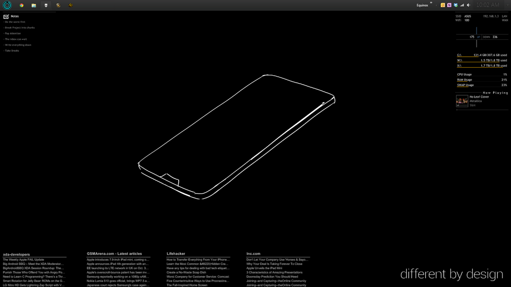
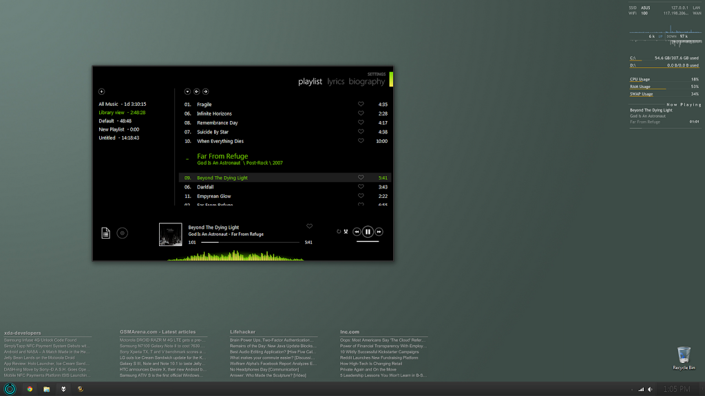
Anyhow, we have another desktop, this time a minimal Win7 setup, along with my recent favorite skin for foobar2000, Metro.

Desktop Screenshot: August 2012

The setup is simple, featuring Rainmeter as usual, but also having some additional tricks.

Tools and Skins used:

Work VII
Rainmeter 2.4
Metro

To install Work VII theme:

  1. Get and run Universal Theme Patcher if you don’t have it already!
  2. Patch the system files (this step is necessary to use shell customizations, which almost all themes rely on)
  3. Copy theme files to WindowsResourcesThemes
  4. Open the .theme/.themepack file to install theme
  5. Done!

Feel free to reach me if you run across any issues while setting things up!

This entry was posted in Mods and tagged , , , , , , . Bookmark the permalink. Follow any comments here with the RSS feed for this post. Post a comment or leave a trackback: Trackback URL.

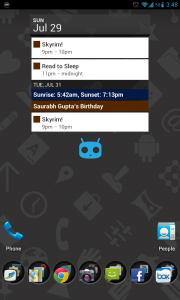
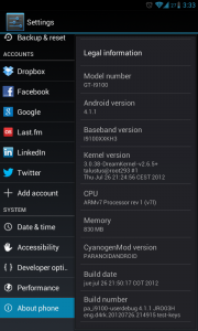
I’ve been using ParanoidAndroid 1.92, a Jelly Bean ROM, as a daily driver on my I9100 for the past week, thanks to CM10 team, and D4rKn3sSyS over at XDA. There have been *almost* no issues so far. I’ve had some people asking how JB is different from ICS, and so I thought it’s time I post about my experience so far.

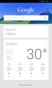
Android JellyBean Screenshot 1 Android JellyBean Screenshot 2 Android JellyBean Screenshot 3

Given that it is still an experimental build, there might be more improvements in the pipeline, and if that happens, I’ll take the time out to post a second review (or update this one). So anyway, let’s move on to the first impressions.

The performance has been amazing even without the Project Butter implementation! It feels a lot faster than ICS. It has some flashy screen transitions, but on the whole, keeps the ICS look and feel which, in my books, is a win.

Google Now is a whole new ball-game. Now does not even require you to ask for things… All relevant information is all displayed as a stack of cards. In fact, Now is smart enough to know that I don’t need to know about the traffic on my way to work on the weekends.

Google Search now uses Google’s Knowledge Graph implementation. Add Voice Search to that, and we have a winner. With the instantaneous responses, it leaves even Siri biting the dust. Voice Search has a better, faster way of presenting information compared to Siri, though it does lack the functionality to add and edit calendar events and such (one of the new things coming in iOS6’s Siri.)

The revamped Notification Tray is out-of-this-world! We all know it provides the ability to display larger notifications, but there is no way you can imagine the impact of this small enhancement till you see it in action. Entire texts and emails can be read, screenshots and images can be previewed, calls made and ended, directly from the notification.

Offline Dictation is simply brilliant! You could easily type out entire emails using it, but to be on the safe side, it does require proofreading.

The Homescreen has been one of the key features of Android’s UI, and it’s great to see that even such a tried and tested system has got some major usability upgrades. Icons simply move out of the way (if possible), instead of giving the “not enough space” toast, making is infinitely faster to rearrange or customize the layout.

The Camera has seen some interface change as well. Now we can simply swipe left to get into the gallery. Pinch to zoom out of the picture on the screen, and you get into a quasi-film-strip view. Swipe all the way to the right, and you get back to the camera. The camera also shows focus state, so you know what’s going on while shooting photographs.

Things are not rosy all-around though. In my first two days with JB, I charged my phone 4 times—that’s a 12 hour life on an average—and I used to get at least twice that with ICS. After letting the ROM “settle” I have noticed better standby times, but as soon as the screen is on, the charge nosedives; in short, battery life disappoints. Given the functionality and performance, and keeping in mind that it’s only an experimental preview, I must say battery shouldn’t be your top priority. What are extended cells for, anyway! 😀

On the whole, JB is just an incremental update, but I’m quite hopeful about how things are turning out. Maybe with the next Android release (the rumoured Key-Lime Pie), Google will have an answer to Passbook.

PS: It seems that PA1.95 is out! It’s going to be another long night…
If you guys have any thoughts or questions, feel free to leave it in the comments below!
This entry was posted in Uncategorized and tagged , , , , , , , , . Bookmark the permalink. Follow any comments here with the RSS feed for this post. Post a comment or leave a trackback: Trackback URL.

I’ve been testing Jelly Bean ROMs over the past few days. I’ve tried three—CM10 Preview, CM10 X-TremE, and ParanoidAndroid 1.92.

They all work flawlessly as stock, except for one thing: gaming performance sucks. So I looked in the forums for a fix, and stumbled upon Dream Kernel. And performance has been dream-like ever since. I believe Dorimanx kernel has been updated to support JB as well!

I’ve been using ParanoidAndroid as a daily driver on my I9100 for the past couple of days, and thanks to CM10 team, and D4rKn3sSyS over at XDA, and I must say, there have been *almost* no issues so far.

I do not think there could be a more stable and functional “Preview” build out there. The only bits not functional yet are HW Composer and Audio over Bluetooth, and there will be updates to get them working quite soon. PieRs Kang even has HW Composer implemented, and that means it has Project Butter working.

There are rumours that Siyah will be updated to support Jelly Bean. I noticed that non-availability of Siyah was a deal breaker for many, but even that is about to change!

Here are the links to some of the ROMs I’ve been talking about…
PieR’s Unofficial CMX Builds
ParanoidAndroid
Official CMX Preview
X-TremE CM10

Feel free to ask questions if you encounter any issues, down in the comments below.
So what are you waiting for? Happy Flashing!

This entry was posted in Uncategorized and tagged , , , , , , , , , , , , , , , , . Bookmark the permalink. Follow any comments here with the RSS feed for this post. Post a comment or leave a trackback: Trackback URL.