When we think of how amazing a concept the Metro UI is, we would expect Microsoft to have put it to good use. Instead, what we have is a Tablet Interface shoved on us Desktop users, and there’s no escaping it.
I have themed my Windows 7 with what I felt represents the Metro UI concept best.
Theme: WP7 Mango VS
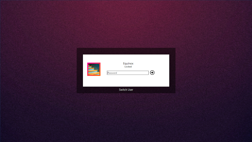
Lockscreen: Metro UI Login
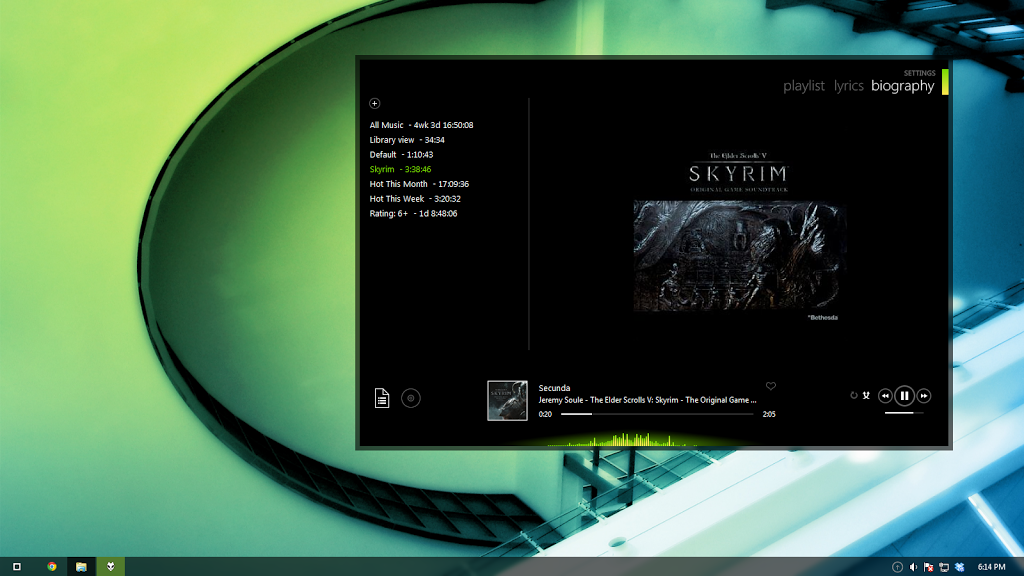
Foobar Skin: Metro
There is a lot of room for improvement (icons, colors, fonts, etc) and I will get around to tweaking it at some point, but this is a lot better than the joke we’ve got in the name of Windows 8.
Lockscreen:
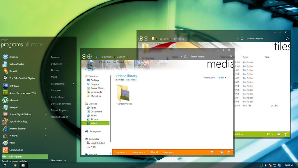
Explorer and Start Menu:
Media Player:
What do you guys think? And while you’re at it, you should check out this Concept.